Designing the Jellyfish: Shape, Pixels, and Light.
The AirJelly jellyfish is not a sprite. Its bell is calculated from a curve, the pixel look comes from rendering at low resolution, and its glow comes from a small light map. Here is how we built those parts and what they let the character do inside an AI product.
By Hua · AirJelly team ·
Open the Jellyfish Lab and you will meet our mascot swimming through the office, with beaded tentacles behind it and a patch of coloured light on the floor. It looks like a sprite, but it is drawn from scratch while the page is running.
The bell shape, face, tentacles, pixel grain and glow all come from a small set of parameters. Each one is exposed as a slider, so the article follows controls you can try in the lab yourself.
- The bell is calculated row by row. Five bell shapes use five different width curves; a face needs only one to three pixels per eye.
- The world is rendered into a canvas one-quarter the size of the viewport, then stretched back up without smoothing.
- Glow comes from a 1/16-scale light map with a squared falloff, stepped light levels and a 4×4 dither matrix.
Every picture here is a screenshot from the lab. We used the same peach jellyfish throughout, with the author's hand-drawn face preset. Nothing was mocked up for the article.
1. The character is a function
A pixel-art character usually starts in an image editor. Ours started with a question: what is the smallest description of “a jellyfish” that still lets someone make theirs look different from mine?
The answer turned out to be a width curve. The bell is drawn one row at a time, top to bottom, and the only thing that changes between a bell, a dome, a blob, a lantern and a droplet is the function that says how wide each row is. A dome opens fast with a soft shoulder; a blob is widest in the middle and pinched at both ends; a lantern opens in the first sixth and tucks in over the last fifth; a droplet reaches full width about three-quarters of the way down and then narrows; a plain bell is a straight flare.
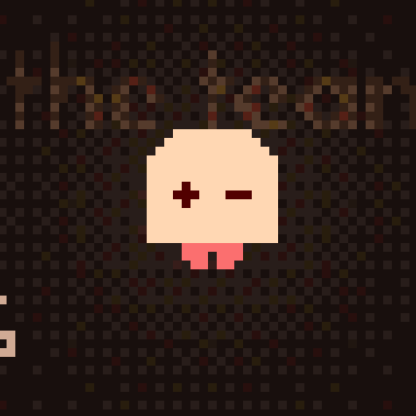
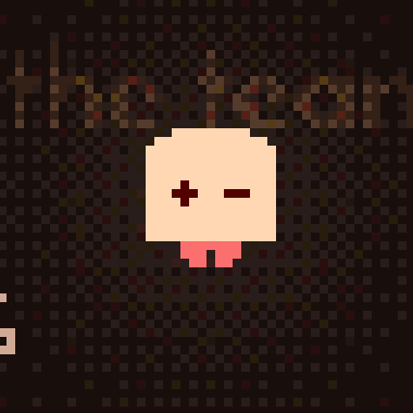
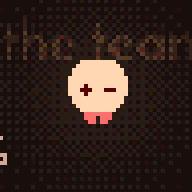
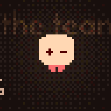
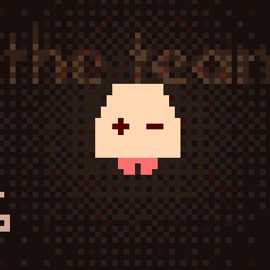
Two small rules sit underneath the curve. The “roundness” slider (1–4) decides how many rows the crown takes to flare out. Every row also has an odd width. That centre column matters more than it sounds: the eyes and mouth can sit dead centre instead of half a pixel off.
From here the rest of the body follows. Width, top width, height, roundness and squash are five sliders. Because the shape is computed rather than stored, the bell can also deform: when you drag it, the row you grabbed leans further than the rows far from your cursor. That single rule is what makes it feel like soft rubber instead of a rigid card.
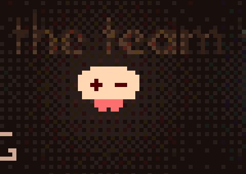
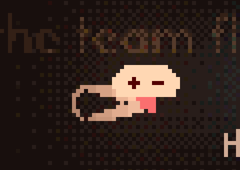
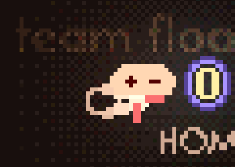
Rotation is handled the same way, but backwards: instead of rotating pixels forward (which would leave holes), the renderer walks the rotated bounding box, maps each screen cell back into bell space and asks “is this inside row r?”. Nearest-neighbour, no anti-aliasing, so a tilted jellyfish stays as crisp as an upright one.
The face
Eyes sit at 54% of the bell height, spaced 18% of the bell width apart. Those two ratios are the whole layout system. Expression is then just which one-to-three pixels get lit: a dot, a dash, a ^, or a dot nudged one pixel up or inward. Curious is one eye slightly higher than the other. Stuck is both eyes pushed toward the nose. Sleepy is two dashes. Dizzy — triggered by three sharp turns inside 850 ms — is two wide dashes and a wobble.
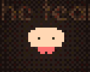
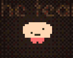
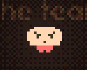
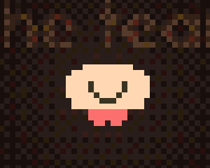
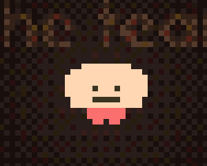
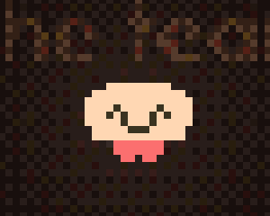
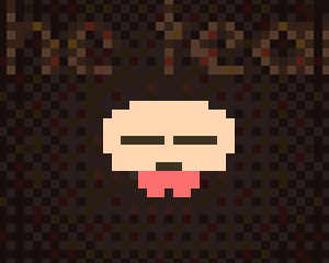
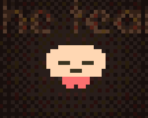
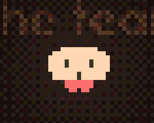
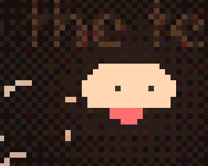
What sells the face is not the pixels but where they look. The eyes are the one part of the body that gets its own motion rules: they flick one pixel against the direction you yank the bell, and while you swim with the keyboard they lead into the turn before the body does. The mouth only appears when the jellyfish is talking or emoting; while it talks, it opens and closes on a fast sine. None of this needed a frame of animation to be drawn.
Tentacles
There are no oral arms and no tentacle sprites. Each tentacle is a chain of square beads under Verlet integration, anchored at 28% down the bell, with three distance-constraint passes per frame to keep the beads at their “gap” distance. What makes them feel underwater is three sine waves at three different frequencies — a slow drift, a faster sway, and a curl weighted toward the tail — so roots stay calm and tips wave. Move the cursor through them and they part and swirl; stop and they settle at their own pace.
The tentacle sliders (count 3–12, segments 4–18, gravity, friction, tension, current, curl, avoidance) are exposed directly, and four one-click “motion presets” — Still, Lively, Wild, Drift — are nothing more than four saved combinations of those six numbers.
Colour
Seven three-colour palettes ship by default — bell, tentacles, eyes — plus free-form colour pickers for each:
| Palette | Bell | Tentacles | Eyes |
|---|---|---|---|
| ocean | #8ae2ff | #8ae2ff | #303030 |
| sunset | #ffb38a | #ff8fc7 | #3a2a2a |
| lime | #b6f5a0 | #8ce6c0 | #26331f |
| grape | #c7a2ff | #a98cff | #2c2640 |
| rose | #ff9ec4 | #ffc0dd | #3a2630 |
| gold | #ffe08a | #ffd06a | #3a3320 |
| mono | #cfd8e3 | #aab4c2 | #20242b |
The bell colour does more than colour the bell. The engine writes it into the page's accent variable (and the tentacle colour into the secondary accent), so the whole lab UI re-themes to whatever jellyfish you are making. Black, white, greys and the semantic red never change; everything else follows you. And, as we will see in part 3, it also becomes the colour of the light you carry.
If the procedural bell isn't enough, you can turn it off and paint your own on a 6×6 to 28×28 grid, and paint up to eight custom faces on top. Thirteen of our teammates did exactly that; their jellyfish now live in the office scene as NPCs, each with its own body, tentacle count, expression and lines of dialogue.
2. The pixel look is a resolution
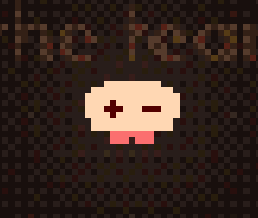
The most common way to get a “pixel look” on the web is to render at full resolution and post-process — snap colours, add a grid overlay, maybe blur and re-quantise. We did the opposite: the world is actually tiny. It is drawn into a canvas one-quarter the size of the window — one world cell is four screen pixels at default scale — and the browser is told to stretch it up without smoothing.
Every draw call in the engine writes packed 32-bit colour values straight into that small buffer — the bell, tentacle beads, terrain tiles, even text. There is no vector path anywhere in the world layer, so nothing can be anti-aliased by accident. Positions are rounded to the cell grid at every anchor: the bell top, the eye row, each terrain tile, the camera offset used by the lighting grid.
This has a nice consequence for the “pixel size” slider. Because it changes how many screen pixels one world cell covers (4 × 0.7 to 4 × 1.6), it changes both the grain of the picture and the apparent size of the jellyfish, in one move. There is no separate zoom.
Two canvases and a layer of real text
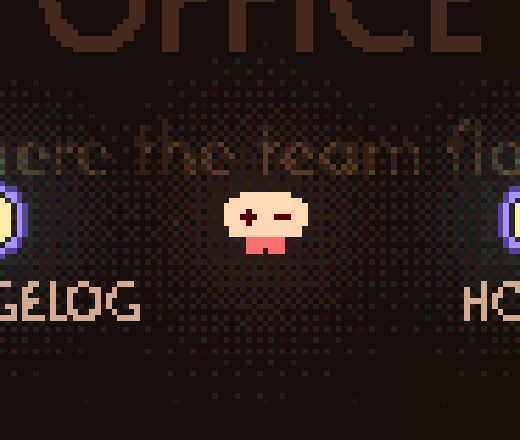
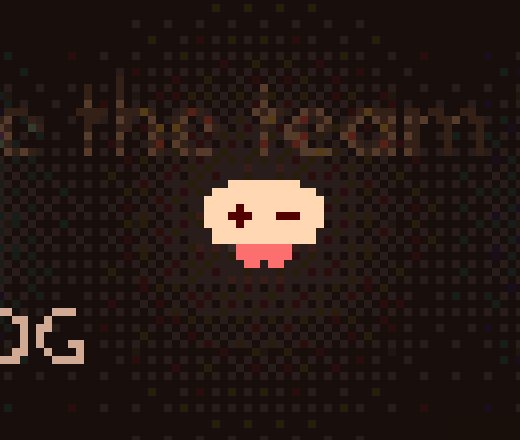
One structural decision we are especially fond of: the world is two canvases with an HTML layer sandwiched between them. Room floors and titles are painted on the bottom canvas. The blog-style copy that lives inside the office is ordinary, selectable, accessible HTML on top of that. The top canvas — water ripples, items, portals, the jellyfish itself — leaves every untouched cell transparent, so text reads through the empty water but the jellyfish swims across it.

The result is text that feels sunk into the scene rather than pasted over it. The background canvas is also cached: it only repaints when the camera moves by a whole cell or the scene changes.
Dither, not gradients
Where the picture needs a gradient — mostly in lighting — we use ordered dithering rather than smooth interpolation. A 4×4 Bayer matrix, indexed by world coordinates so the pattern stays put as you scroll, breaks the light into flat bands and then scatters the seams. “Light steps” is exposed as a slider (2–8, default 3). At 2 the floor looks like a two-tone woodcut; at 8 it is close to smooth. Three is where it still looks hand-made.
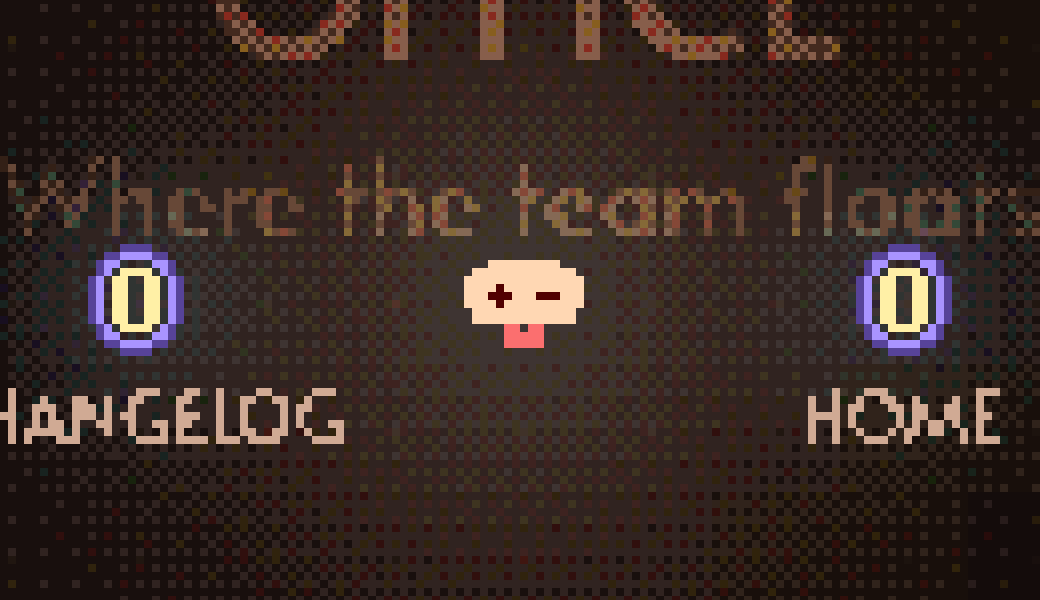
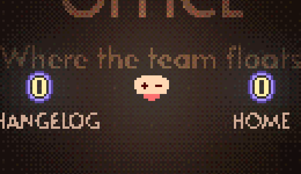
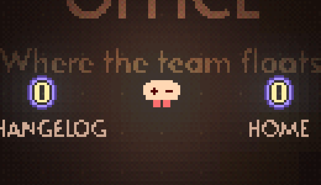
Colour grading — a global tint and saturation pull — goes through a 32×32×32 lookup table, which quietly quantises the palette to five bits per channel as a side effect. Every preview canvas in the UI has smoothing off; the only place the engine uses a CSS blur is on UI transitions, never on the world.
3. The glow is a light field
A jellyfish that doesn't glow isn't a jellyfish. The obvious implementation — a soft radial halo blended over the scene, or a blur pass — was ruled out on day one because it produces smooth, sub-pixel gradients that look wrong on a hard pixel grid. A smooth halo floats over the world; it doesn't belong to it.
So instead of drawing a glow, we light the room. Every light — the jellyfish, lamps, glowing items — is stamped into a small light map at one-quarter of the canvas resolution (one-sixteenth of the screen), with a (1 − d/r)² falloff: not physically correct, but soft, cheap and easy to tune. The floor and the furniture are then brightened by how much light reaches them, in the same three flat steps with the same dither. Two maps are kept — one for the floor and one for objects with a 1.6× wider radius, so props sit inside a slightly larger halo than the ground under them.
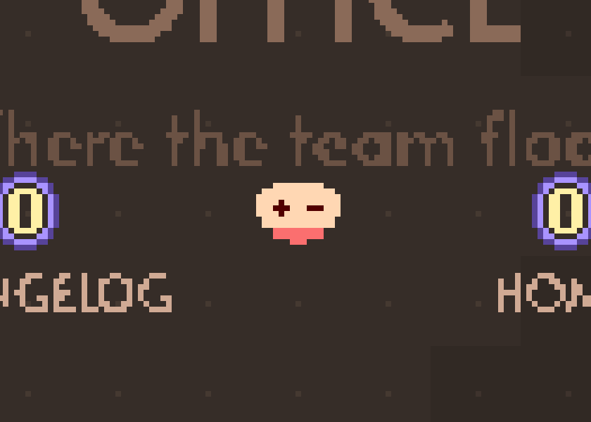
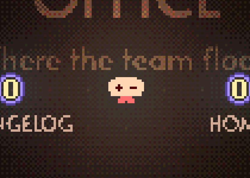
The shading pass multiplies each pixel by ambient plus the light field, clamped to a ceiling. That ceiling — 1.25, meaning light can push a colour to 125% of itself and no further — is the whole “bloom” budget. It's where the slightly over-exposed core of the glow comes from, and it's the difference between a lantern and a lens flare.
Three implementation details are easy to miss:
- The bell colour is also the light colour. Pick a rose jellyfish and the nearby floor turns rose; the same hex value updates the lab's accent colour.
- Colour is normalised by its peak channel, so a dark navy bell still casts a full-strength navy tint instead of barely lighting the room.
- Flicker updates every 8 frames. A slight stutter fits this pixel world better than a perfectly smooth shimmer.
One more rule keeps lamps from looking wrong: anything that emits light is excluded from being lit. Items with a light component are drawn with an emissive mask, and the shading pass copies those pixels through untouched — so a lamp is never darkened by its own ambient.
The knobs
All of this is exposed in the Scene → Light panel. These are the numbers we ended up shipping:
| Control | Range | Default |
|---|---|---|
| Ambient brightness | 0.2 – 1 | 0.55 |
| Ambient colour | — | #6d8fae |
| Light steps | 2 – 8 | 3 |
| Highlight ceiling | 1 – 1.5 | 1.25 |
| Jellyfish glow · radius | 8 – 80 | 32 |
| Jellyfish glow · strength | 0 – 1.5 | 0.6 |
| Jellyfish glow · flicker | 0 – 0.6 | 0.05 |
The floor is only re-shaded when the level, the shader parameters or the light positions change; lights outside the viewport are culled before they are stamped; the grading table is cached. In practice the whole world — background, water simulation, items, tentacles, lighting, jellyfish — comfortably fits in a single animation frame on a laptop, at a resolution where a 1440px-wide window is only 360 cells across.
4. A few things about how it moves
Not strictly about looks, but they shape how the character reads, so briefly:
- Keyboard thrust builds up and damps down, capped at just under one cell per frame. Speed also feeds the bell deformation, so a fast swim visibly squashes it against the “current”.
- A wheel notch feeds an impulse into the same velocity as the keyboard and works out to one cell of steady-state travel.
- The camera follows slowly while you swim, faster while settling, and very slowly for 1.6 seconds after a drag so it does not snap back.
- Horizontal velocity sets a target tilt. A stiff, damped spring follows it and lets the bell overshoot slightly when it stops.
- The cursor pushes tentacle beads away inside 40 px. Inside 58 px it also adds a swirl and radial pulse, weighted toward the tail.
- Every two cells of travel adds a soft pulse to the 2D wave simulation. Those waves can trigger items, which can pass the pulse on.
5. Why make the character from data
We did not start with a theory about AI characters. We started with a jellyfish editor, then noticed a practical advantage: the same parameters that make the character customisable also make it legible to an agent.
Parameters are easier for an agent to use
A sprite sheet is opaque to a model. Our jellyfish is about thirty numbers and a few enums, small enough for a prompt, a JSON blob or a tool call.
- An agent can read the parameters and know what its user's jellyfish looks like.
- It can turn “make me a sleepy purple one with long tentacles” into a preset without generating a new image. Each teammate's NPC is a data row rather than an art asset.
- Expression, glow and motion are runtime state, so the mascot can look focused while the agent works or dizzy when it gets confused.
- The parameters can vary widely while the result still looks like the same kind of jellyfish.
That is the useful part for AirJelly. The mascot can act as the agent's body because its appearance and behaviour are data the agent can read and change. We never have to ask a model to edit an opaque image.
Why we still like pixels (and ASCII)
There is a practical reason. A pixel sprite is a small grid of palette indices; ASCII art is already text. Both can be described compactly and edited cell by cell. For the precise changes we need, a 16×16 sprite simply leaves a model less room to improvise than a painting does.
There is also a more subjective reason: we like hard grids. They are honest about being made by a machine, and a one-pixel mistake often looks charming instead of uncanny. That tone suits a product about an AI living on your computer. It may be why terminals feel comfortable in AI tools too.
So this is where we landed: a character described by numbers and drawn on a grid. It happens to look retro, but the useful part is how easy it is for both a person and an agent to change precisely.
One last thing. If you tune a jellyfish you like in the lab, export its parameters and send them to xiaohua@airjelly.ai — we'll put it on the site. Thirteen already live in the office; there is always room for one more.